MEDITATION STUDIO
MEDITATION STUDIO
SUBSCRIPTION OFFER


CLIENT
Meditation Studio
PROJECT
In the fall of 2017 the Meditation Studio team transitioned from a one-time purchase app model to a subscription based service. The decision was not made lightly and all options were weighed as both business goals and user desires were considered.
We have always had a strong commitment to continually providing new content and features to users. Unfortunately, the reality of content creation and feature generation lies in operation costs. The one-time purchase model simply would not allow us to sustain our commitment to our users.
This case study will concentrate on the user experience and visual design of the change in our business model.
MY ROLE
As the Senior Product Designer, I was responsible for the strategy, visual design and user experience research of the subscription transition and legacy messaging. I worked with the founders, copywriter, and iOS developer to ensure a cohesive strategy and implementation with the in-app experience and the external website messaging.
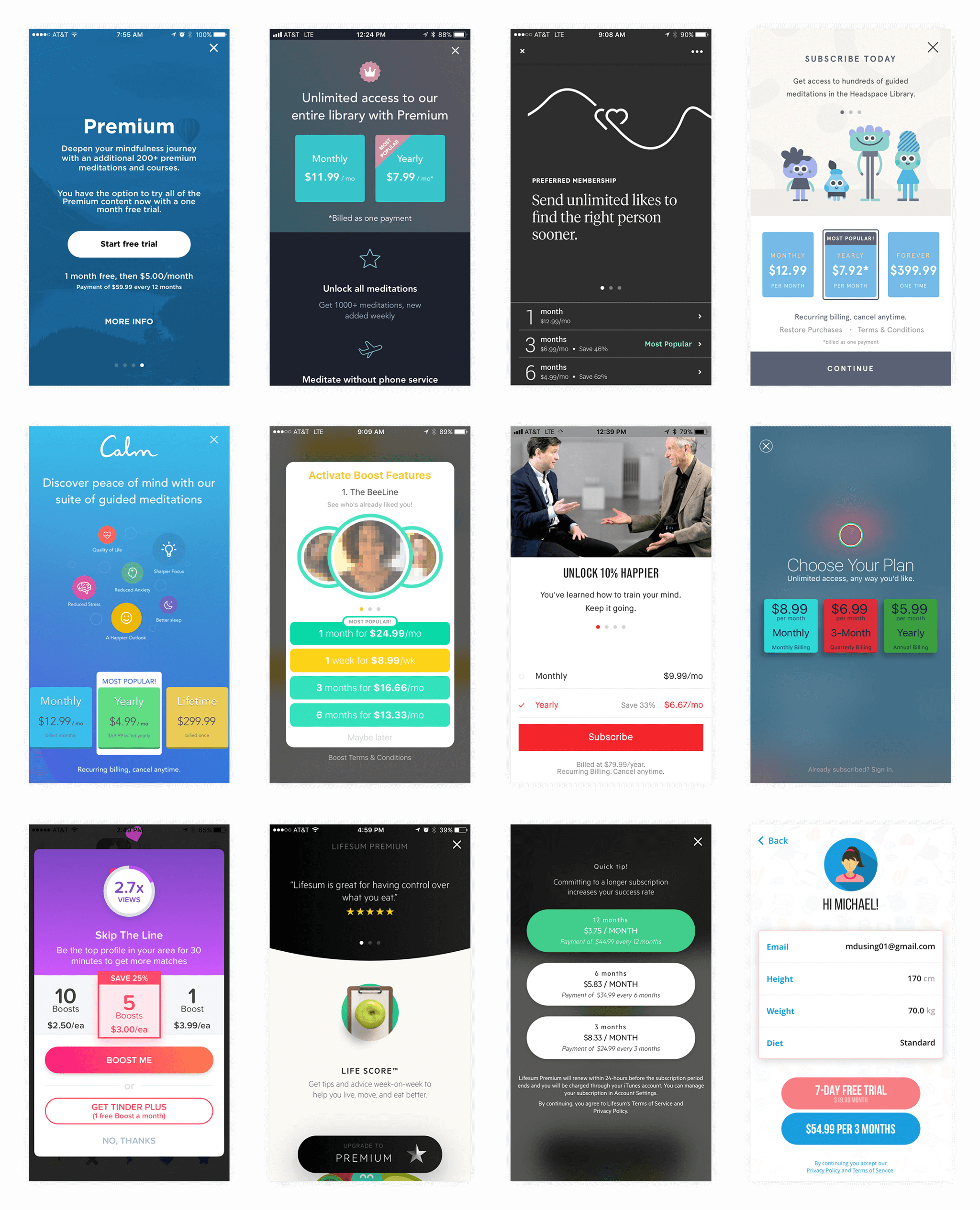
We started with competitive research in the digital meditation space. Pricing models were considered based on our current content and feature offerings as well as our future roadmap. For visual direction and best practices we looked to another category; dating apps.
We started with competitive research in the digital meditation space. Pricing models were considered based on our current content and feature offerings as well as our future roadmap. For visual direction and best practices we looked to another category; dating apps.
We started with competitive research in the digital meditation space. Pricing models were considered based on our current content and feature offerings as well as our future roadmap. For visual direction and best practices we looked to another category; dating apps.
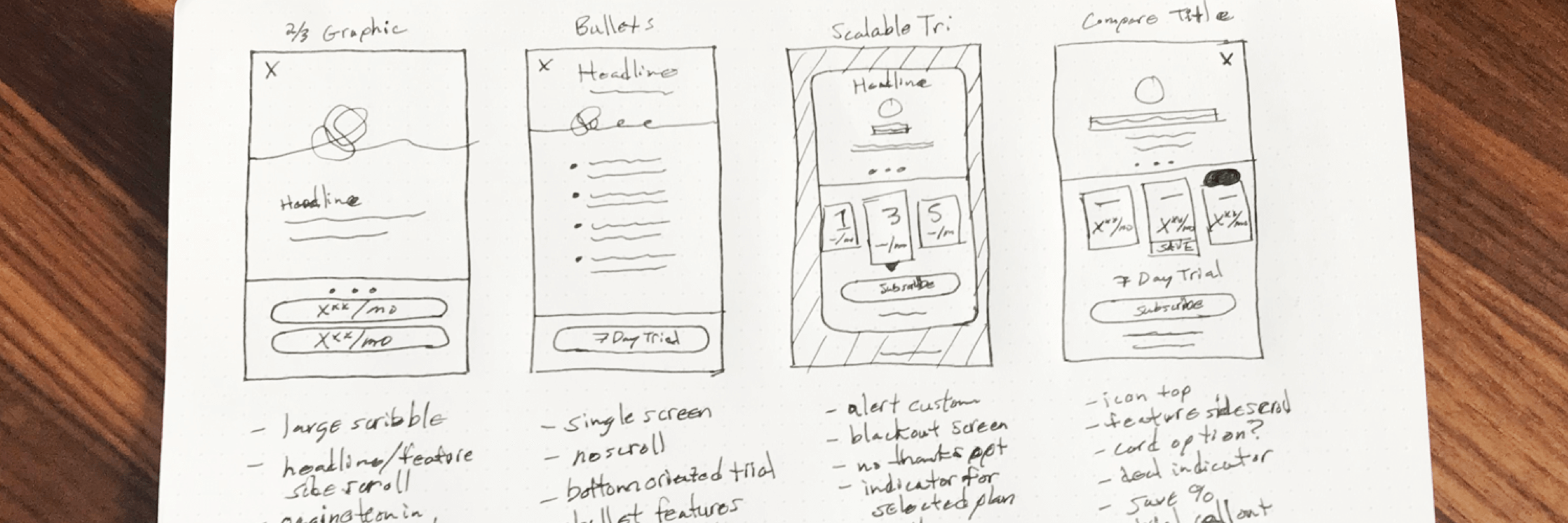
Upon completion of our research and discussions with industry experts we developed sketches outlining the visual presentation of our key learnings. Key learnings included:
Upon completion of our research and discussions with industry experts we developed sketches outlining the visual presentation of our key learnings. Key learnings included:
Upon completion of our research and discussions with industry experts we developed sketches outlining the visual presentation of our key learnings. Key learnings included:
- Users prefer having more than two choices
- The presence of a third option increases subscription
- Displaying prices in a common duration increases conversions
- The presence of trial messaging increases subscription
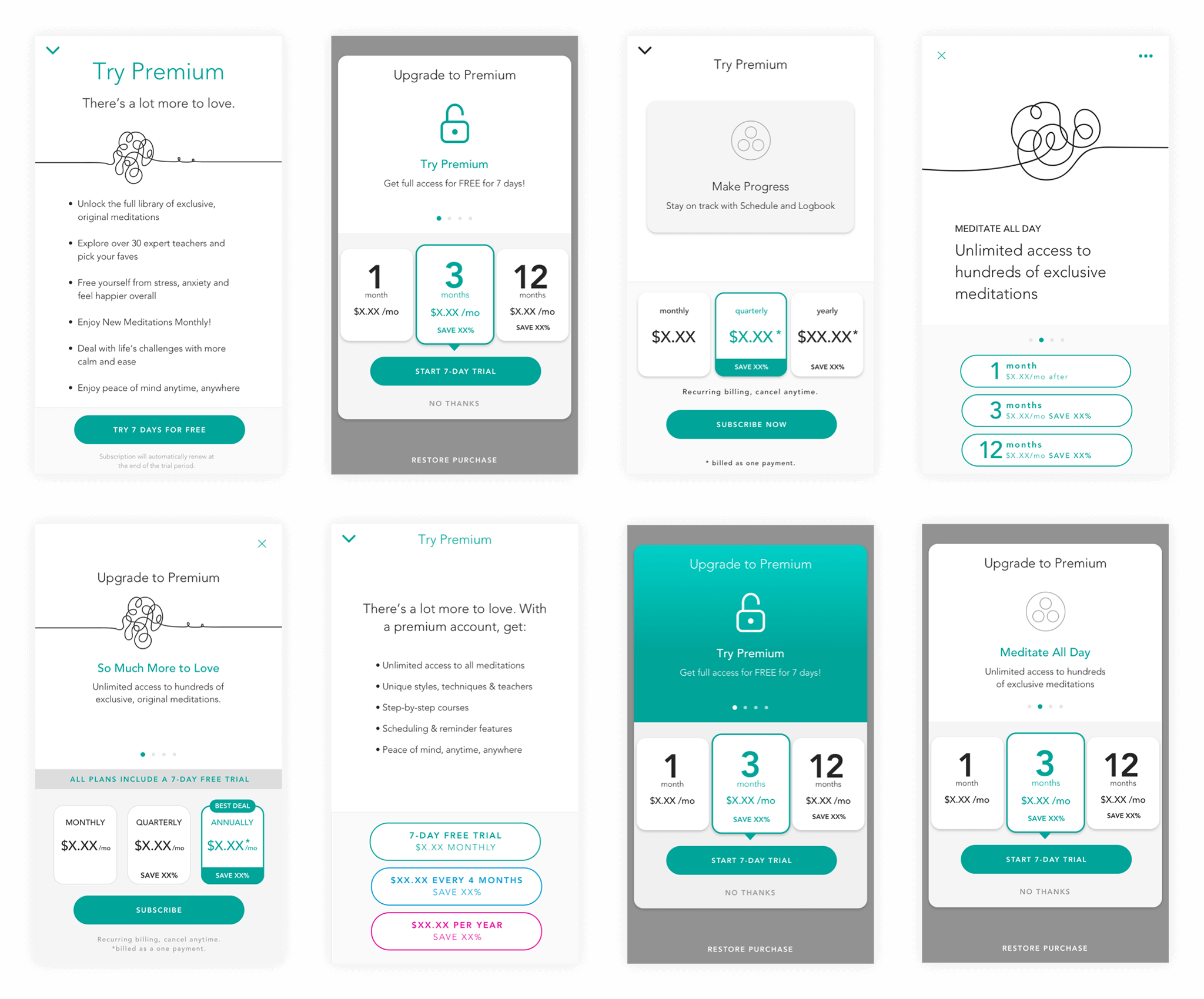
Taking our learnings and design feedback we moved forward with concepts mixing a variety of elements. The visual design mixed these components:
Taking our learnings and design feedback we moved forward with concepts mixing a variety of elements. The visual design mixed these components:
Taking our learnings and design feedback we moved forward with concepts mixing a variety of elements. The visual design mixed these components:
- Fullscreen modals
- Alerts
- Bullet lists
- Feature titles & descriptions
- Potential plan savings
- Bottom-oriented CTA
- Fullscreen modals
- Alerts
- Bullet lists
- Feature titles & descriptions
- Potential plan savings
- Bottom-oriented CTA
- Visual interest - graphics/icons
- Trial messaging
- Restore purchase option
- Dismiss icon or text
- Feature pagination
- Consistency across device sizes
- Visual interest - graphics/icons
- Trial messaging
- Restore purchase option
- Dismiss icon or text
- Feature pagination
- Consistency across device sizes
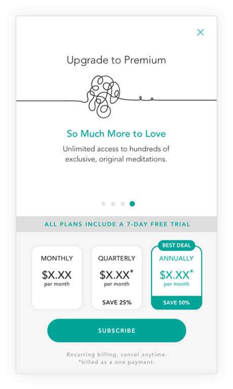
Ultimately we landed on a rotating feature area with a branded graphic for the first iteration in beta testing. The plans are presented side by side at an equivalent monthly rate for easy comparison. Upon subscription selection and confirmation Apple IAP displays an iTunes subscription confirmation with details.
Ultimately we landed on a rotating feature area with a branded graphic for the first iteration in beta testing. The plans are presented side by side at an equivalent monthly rate for easy comparison. Upon subscription selection and confirmation Apple IAP displays an iTunes subscription confirmation with details.
Ultimately we landed on a rotating feature area with a branded graphic for the first iteration in beta testing. The plans are presented side by side at an equivalent monthly rate for easy comparison. Upon subscription selection and confirmation Apple IAP displays an iTunes subscription confirmation with details.
Our small app team of two in-house and a development partner did an amazing job making the Apps for Earth version and accomplished everything in time for launch.
Now it was time to make it all happen! As a part of the campaign we had placement across all of Gaiam’s marketing network; the Yoga Studio website, Yoga Studio social, Gaiam website, Gaiam email, Gaiam social, and banner advertising.
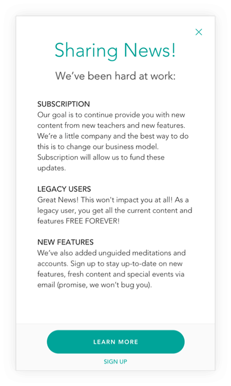
One of the most important aspects of the transition will be to clearly communicate the changes to our existing users; now referred to as “legacy” users. Legacy users will be presented with a modal message after updating the app and given free access to all new features and content for this release as a reward for their loyalty and help getting us to this point. A brief description is given and the new features are explained in a detailed blog post on our website.
One of the most important aspects of the transition will be to clearly communicate the changes to our existing users; now referred to as “legacy” users. Legacy users will be presented with a modal message after updating the app and given free access to all new features and content for this release as a reward for their loyalty and help getting us to this point. A brief description is given and the new features are explained in a detailed blog post on our website.
After release of the new version we concentrated on feature and content feedback. Offer messaging was included in a separate feedback loop after ensuring the features and content were well received based on our key learnings. As with all changes in business models we strived for a balance between a minimal impact to the experience of our legacy users and an appreciation of added value to potential new users. Only time will tell how things will work out. By conducting upfront research and consulting with industry experts we did the work to set ourselves up for success.
After release of the new version we concentrated on feature and content feedback. Offer messaging was included in a separate feedback loop after ensuring the features and content were well received based on our key learnings. As with all changes in business models we strived for a balance between a minimal impact to the experience of our legacy users and an appreciation of added value to potential new users. Only time will tell how things will work out. By conducting upfront research and consulting with industry experts we did the work to set ourselves up for success.
After release of the new version we concentrated on feature and content feedback. Offer messaging was included in a separate feedback loop after ensuring the features and content were well received based on our key learnings. As with all changes in business models we strived for a balance between a minimal impact to the experience of our legacy users and an appreciation of added value to potential new users. Only time will tell how things will work out. By conducting upfront research and consulting with industry experts we did the work to set ourselves up for success.
After release of the new version we concentrated on feature and content feedback. Offer messaging was included in a separate feedback loop after ensuring the features and content were well received based on our key learnings. As with all changes in business models we strived for a balance between a minimal impact to the experience of our legacy users and an appreciation of added value to potential new users. Only time will tell how things will work out. By conducting upfront research and consulting with industry experts we did the work to set ourselves up for success.
After release of the new version we concentrated on feature and content feedback. Offer messaging was included in a separate feedback loop after ensuring the features and content were well received based on our key learnings. As with all changes in business models we strived for a balance between a minimal impact to the experience of our legacy users and an appreciation of added value to potential new users. Only time will tell how things will work out. By conducting upfront research and consulting with industry experts we did the work to set ourselves up for success.