GUILD EDUCATION
GUILD EDUCATION
REIMBURSEMENT FLOW

CLIENT
Guild Education
PROJECT
In the spring of 2019 I was fortunate to work as a part of the Guild Education reimbursement team. At the time the reimbursement customer support team was spending a great deal of time reviewing reimbursement requests.
Some requests even took as many as 3 or 4 submissions before they could be approved. The approval rate for first time reimbursement submissions was only 15%; 85% of requests were rejected on first submission requiring review and student adjustments before they could be approved.
MY ROLE
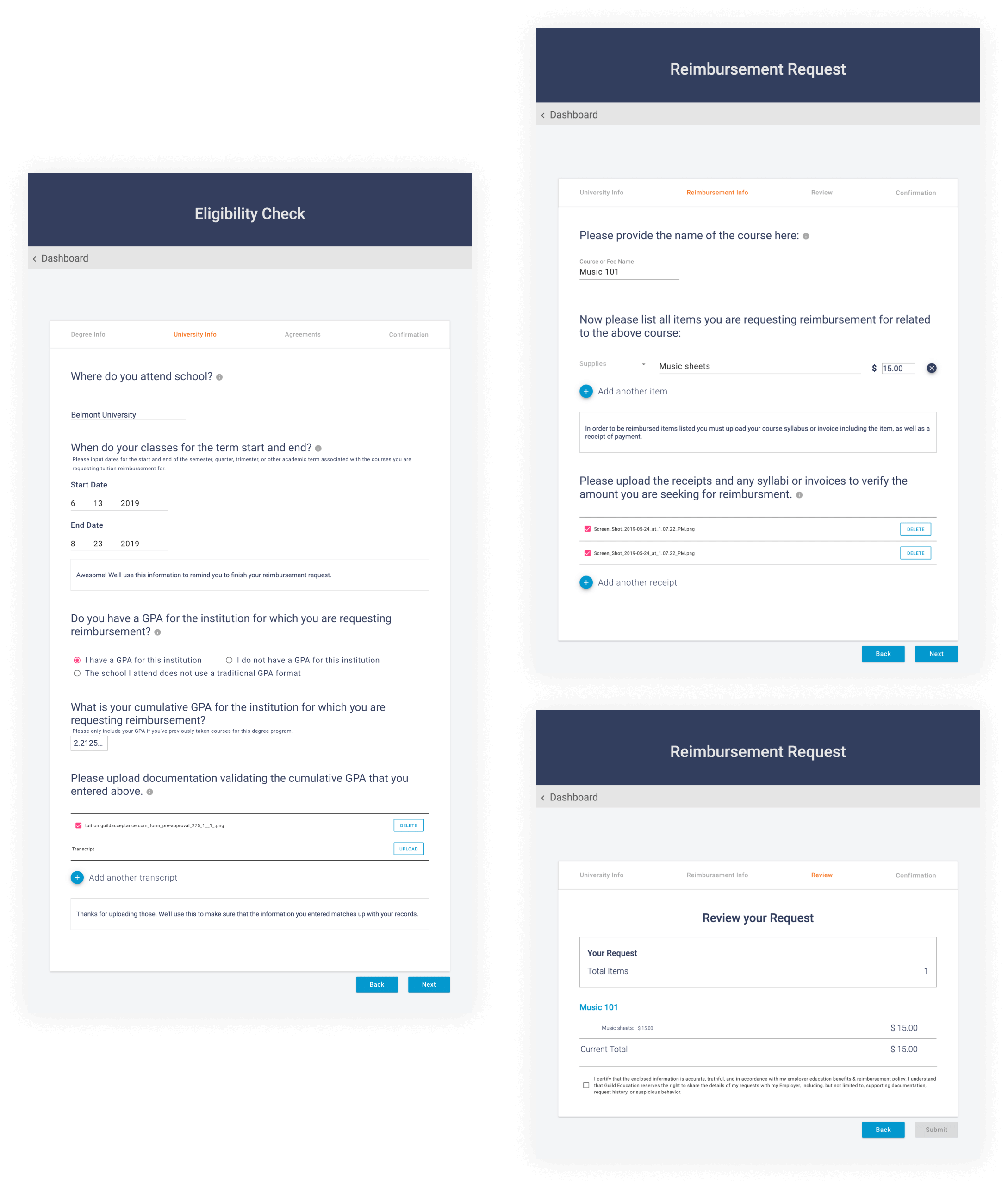
As the Senior Product Designer, I worked with the reimbursement customer support team to understand where the most time was being spent and how we could improve the UX of submission to gain efficiency. To help students and the internal team reviewing requests we endeavored to improve the clarity of self-service submission of requests for tuition, book, fee and supply reimbursement.
CONSIDERATIONS
- The current tool for reimbursement was built considering only tuition with the books, fees, supplies flows added at a later date.
- The current tool for reimbursement was built considering only tuition with the books, fees, supplies flows added at a later date.
- The infrastructure of the tool required students to follow a flow for both tuition AND books.
- Students from the same employer could not submit reimbursement requests for books or tuition individually without answering questions pertaining to both.
- A third party tool was being used for specific employers to allow flexibility outside the limitations of current infrastructure. This was a security risk.
- Entry fields allowed for open ended/undefined responses with no clear list of acceptable expenses.
PROBLEM
The first time approval rate of reimbursement requests was 15%;
85% were rejected on submission.
The first time approval rate of reimbursement requests was 15%; 85% were rejected on submission.
The first time approval rate of reimbursement requests was 15%; 85% were rejected on submission.
HYPOTHESIS
- By making the forms easier to understand we will improve accuracy of entry.
- Improving accuracy should increase first time approvals
- Improving accuracy should decrease processing time and false approvals
- Improving accuracy should decrease the time it takes for students to be reimbursed.
STUDENT GOAL
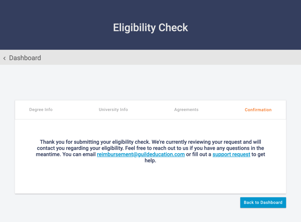
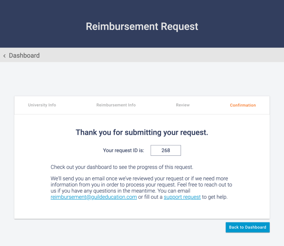
Decrease the time and number of interactions from first time submission to receipt of payment.
Decrease the time and number of interactions from first time submission to receipt of payment.
SUCCESS METRICS
- Increase first time approval rate by 30%
- Decrease processing time (or reallocation to time spent on higher priority/more complex requests)
- Decrease time from submission to reimbursement; current average 21 days
- Decrease false approvals; current 8% of requests
We decided to concentrate on the Book, Fee and Supply reimbursement requests the majority of the team review time was being spent on these more open ended submissions. Initial investigation allowed us to compile a list of data points required by the different employers in order to issue reimbursement of requests. We used that list and data from current requests to compile a standard list for accepted types, categories, and covered uncovered expenses for books, fees, and supplies. The internal team reviewed that list and edited or changed category titles to align to the student vernacular.
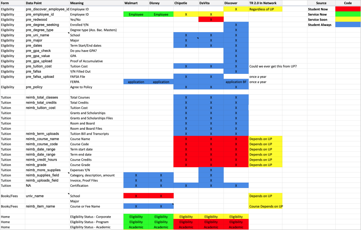
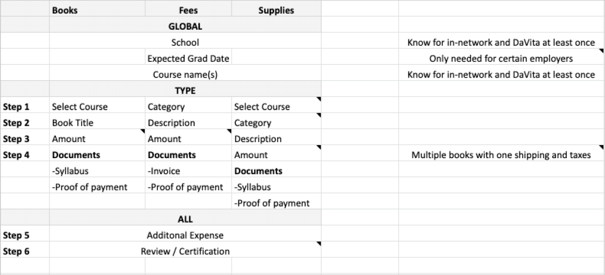
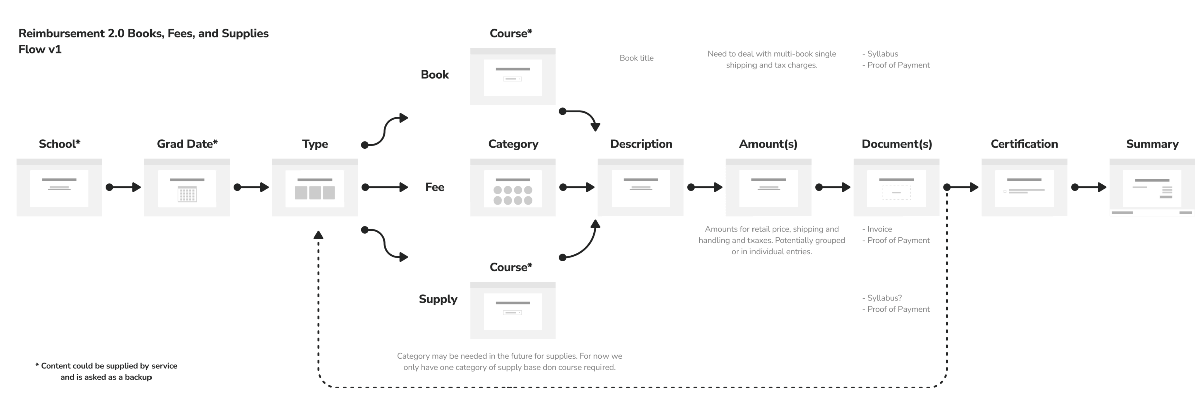
Using the required data points we were able to establish an overall flow diagram for required entry fields per reimbursement type: Book, Fee, Supply.
We conducted pattern research to understand how other complex form flows were being handled in a variety of products and industries. Looking at education, reimbursement, investing, creation, and insurance flows allowed us to get a clear picture of common best practices.
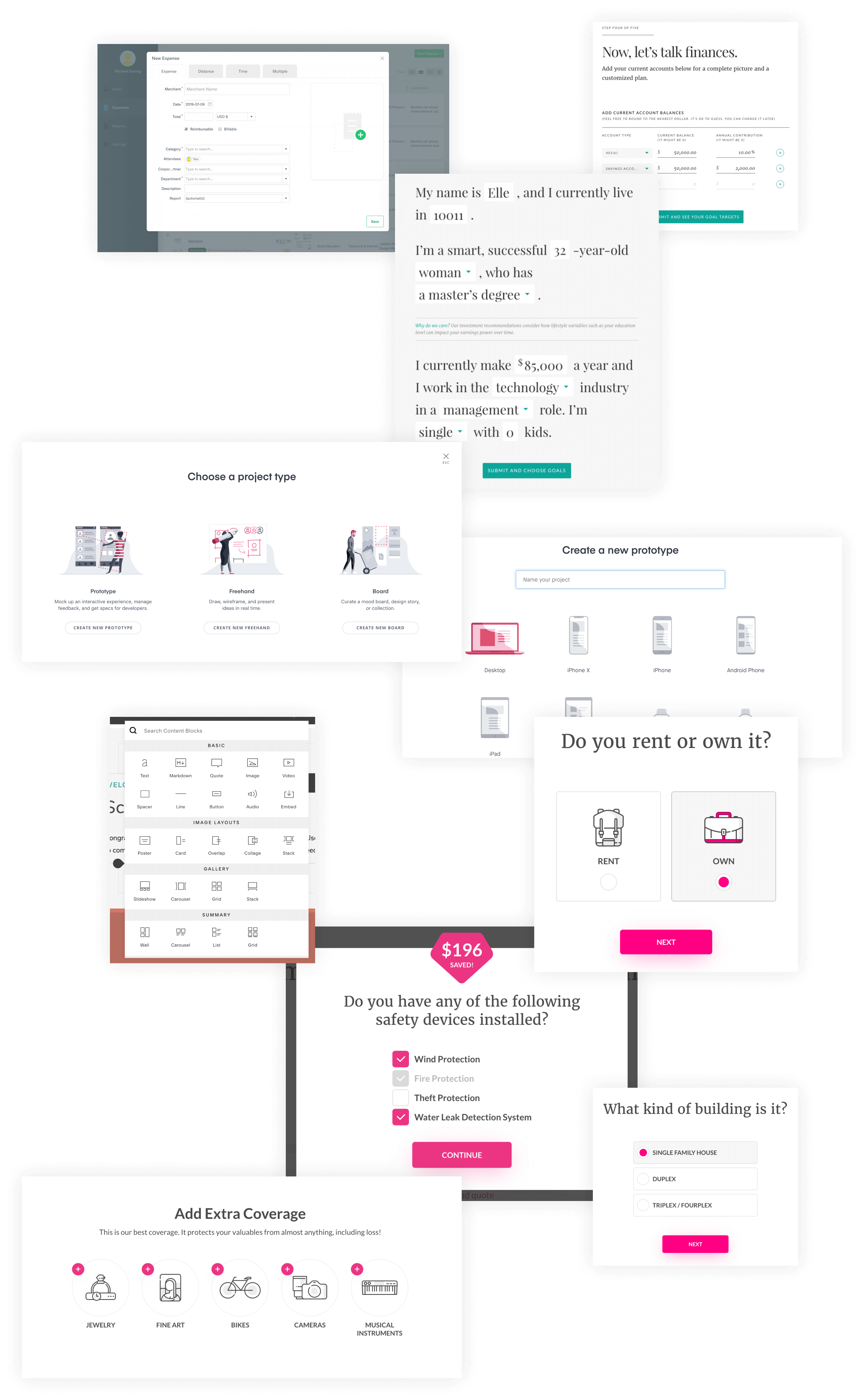
KEY LEARNINGS
- Long/complicated entry processes are improved by separation of
inputs. (sections, groups, single inputs) - There are lots of different ui patterns used to present type
selection; which is best largely depends on the content. - Providing visual breaks in long flows improves the overwhelming
nature of the process - Providing visual feedback to the level of completion helps convey
a sense of accomplishment and establish an expectation of where
and when the process will end.
Based on key learning initial sketches of potential UX solutions were created and considered.
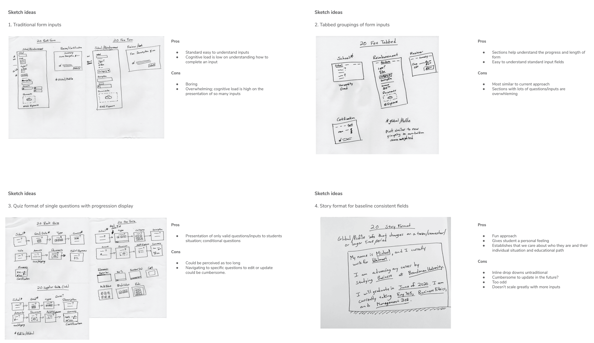
As a result it was decided that the pros and cons of Concept 3: Quiz format single questions aligned best to achieving our goals while allowing the most opportunity for flexibility in the future.
When developing low-fi prototypes we considered; how might we test a lightweight experiment to improve the understanding of fields and accuracy of entry? We conducted user research using usertesting.com and ensured the presentation order of the prototypes was randomized.
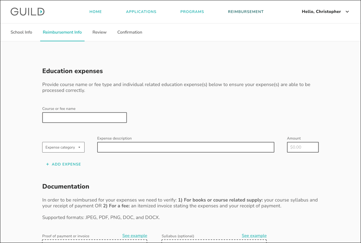
OPTION A
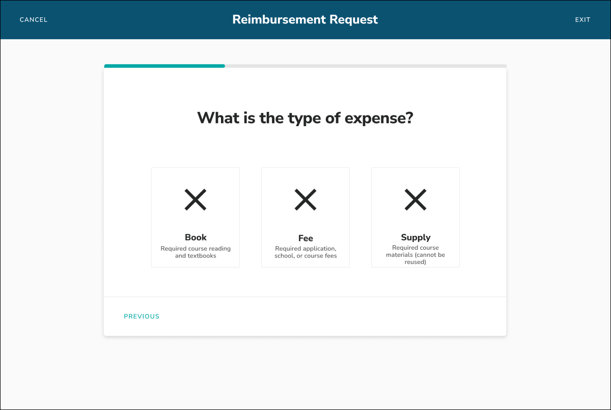
OPTION B
PROTOTYPE A
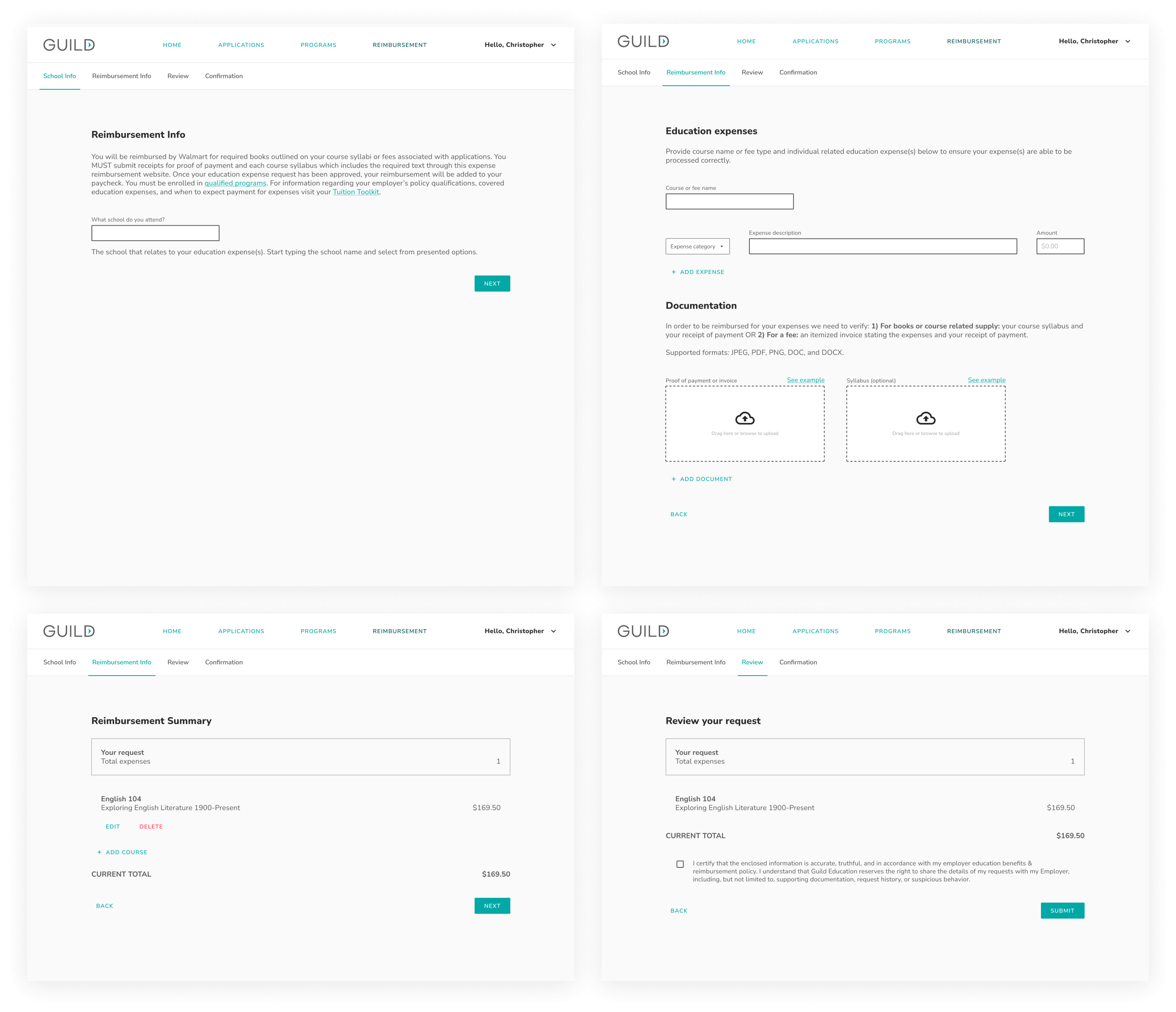
FEEDBACK
PRO
Descriptive Clarification In depth (2)
Most on one page, more on one page
Seamless
Intuitive
Seamed faster
Enjoyed more
More explanation
Preferred “for some reason”, “not sure why”, “A honestly”
ID # was helpful at end
CON
Boring Plain
Overwhelming
Frustrating
Stressful
Too much instruction
More info not necessarily needed
Less user-friendly
Dropdowns
“Reminds me when I first got into the internet”
“Looks like a piece of paper, same as analog process”
“Doesn’t help me”
“Not a fan of tabs”
PROTOTYPE B
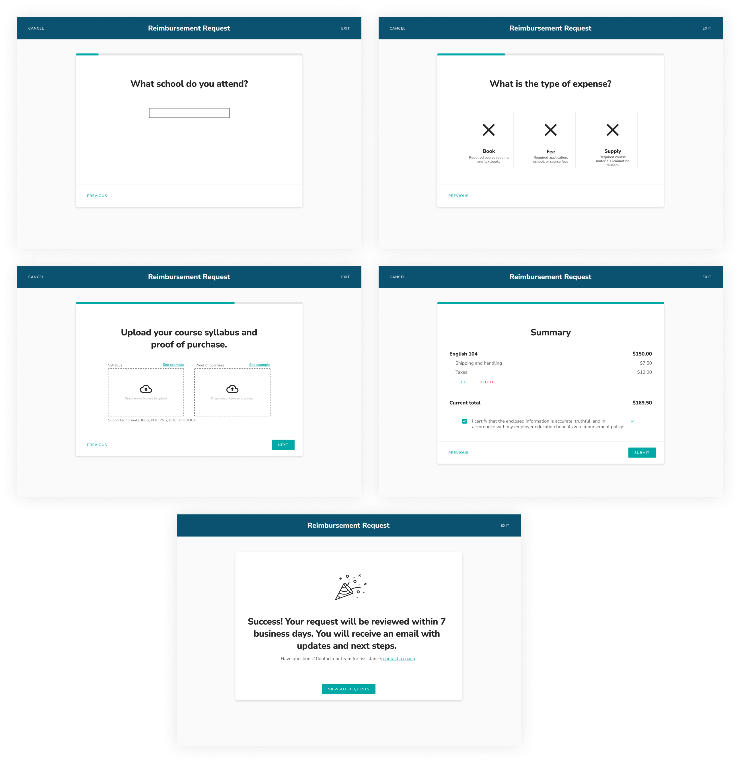
FEEDBACK
PRO
Progress bar (5)
Big icons/fonts (3)
Example of categories (expense types) (3)
Definitely (2)
No questions asked
In Love
LOVE
100%
Without a doubt
Felt engaging
Looked better
Moves along
Minimal
Easy to understand
Easy to use
Easy to navigate
Option to break things up
“Working together to get my money back”
“Let me say, Option B”
CON
Drawn out
Hand holdy
RESULTS
When asked which protoype they preferred, 70% of students preferred Prototype Option B.
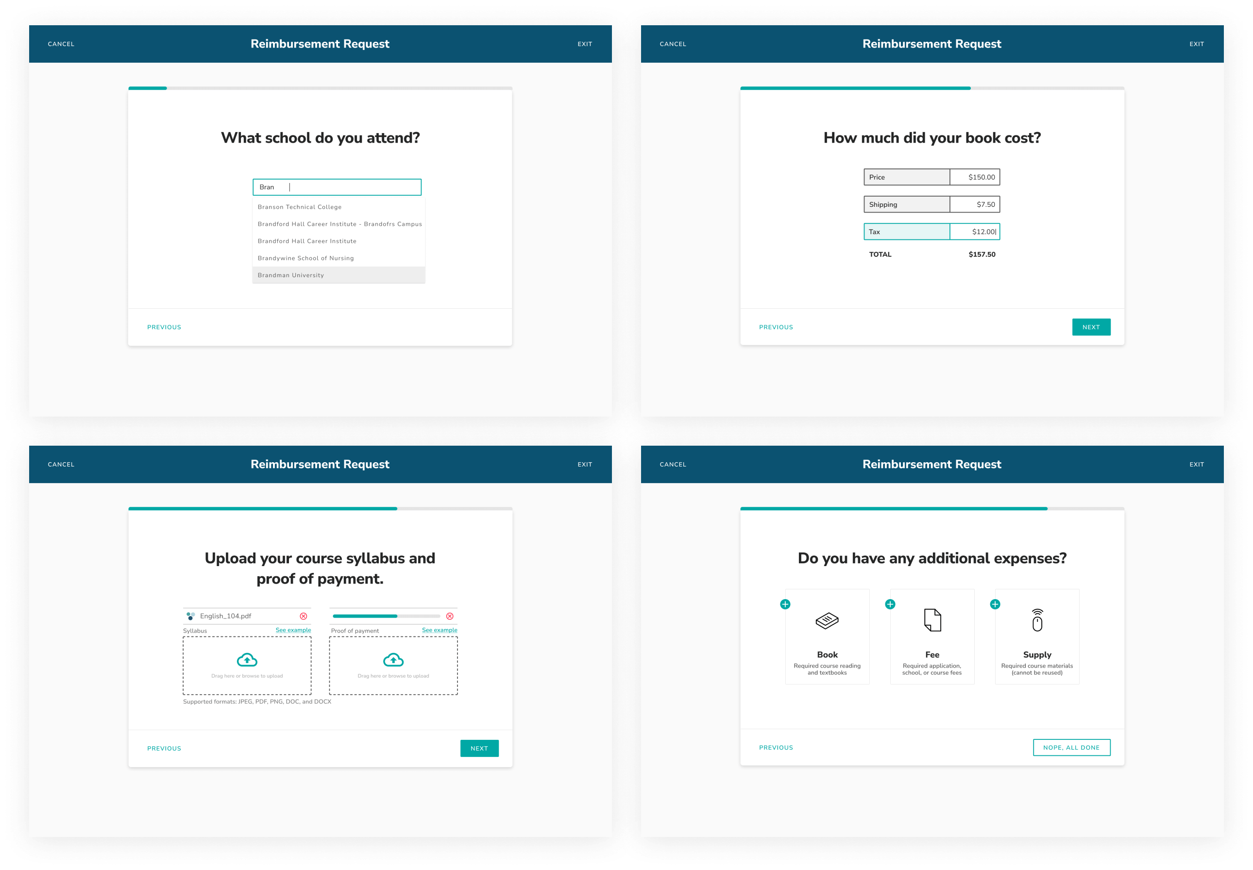
My time at Guild ended before the initial release of the new tool went live. I heard from reimbursement team members later, that the new tool improved first time submission success. As with all large changes products the initial release only covered the books, fees, and supplies requests. The scope was based on key partners with high volume to make the biggest impact on time spent on review; with a goal of expanding to the more complex tuition flow and partners with strict reimbursement requirements.
By conducting upfront research and consulting with industry experts we did the work to set ourselves up for measurable success.